An identity that conveys your brand personality
Category:
ARTICLE
March 6, 2024

The Challenge
Our client was building a community of knowledge graph and data analytics enthusiasts and needed a cohesive brand identity that would set them apart in a competitive market. They wanted a vibrant, modern look that reflected their innovative spirit.
Step 1: Color Options
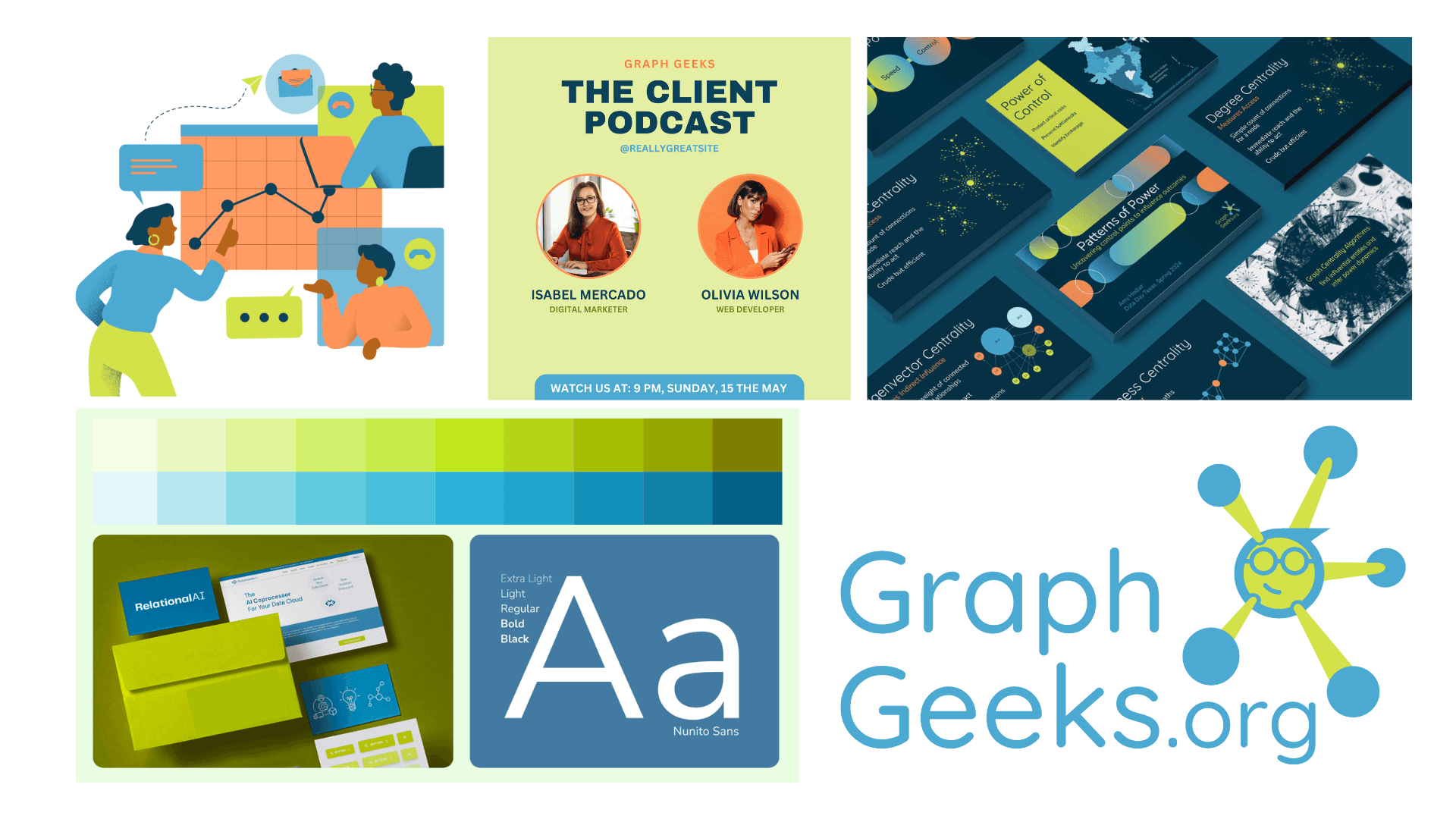
We presented a spectrum of color palettes, each chosen to evoke different emotions and align with the brand's values. After thoughtful discussions and feedback sessions, we zeroed in on a dynamic palette of blues and greens, symbolizing trust and growth.
Homely + Laid back
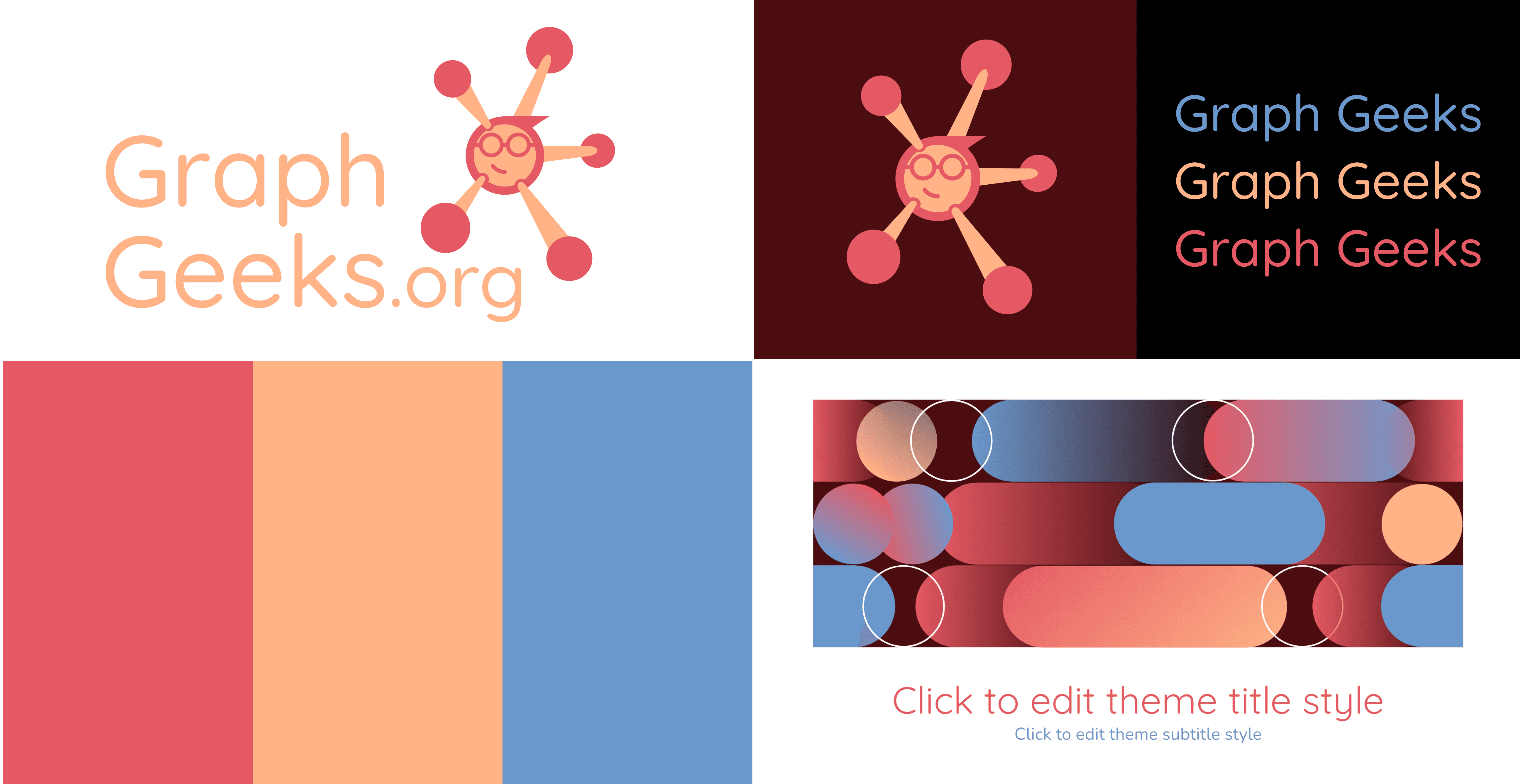
New age + Attention-grabbing
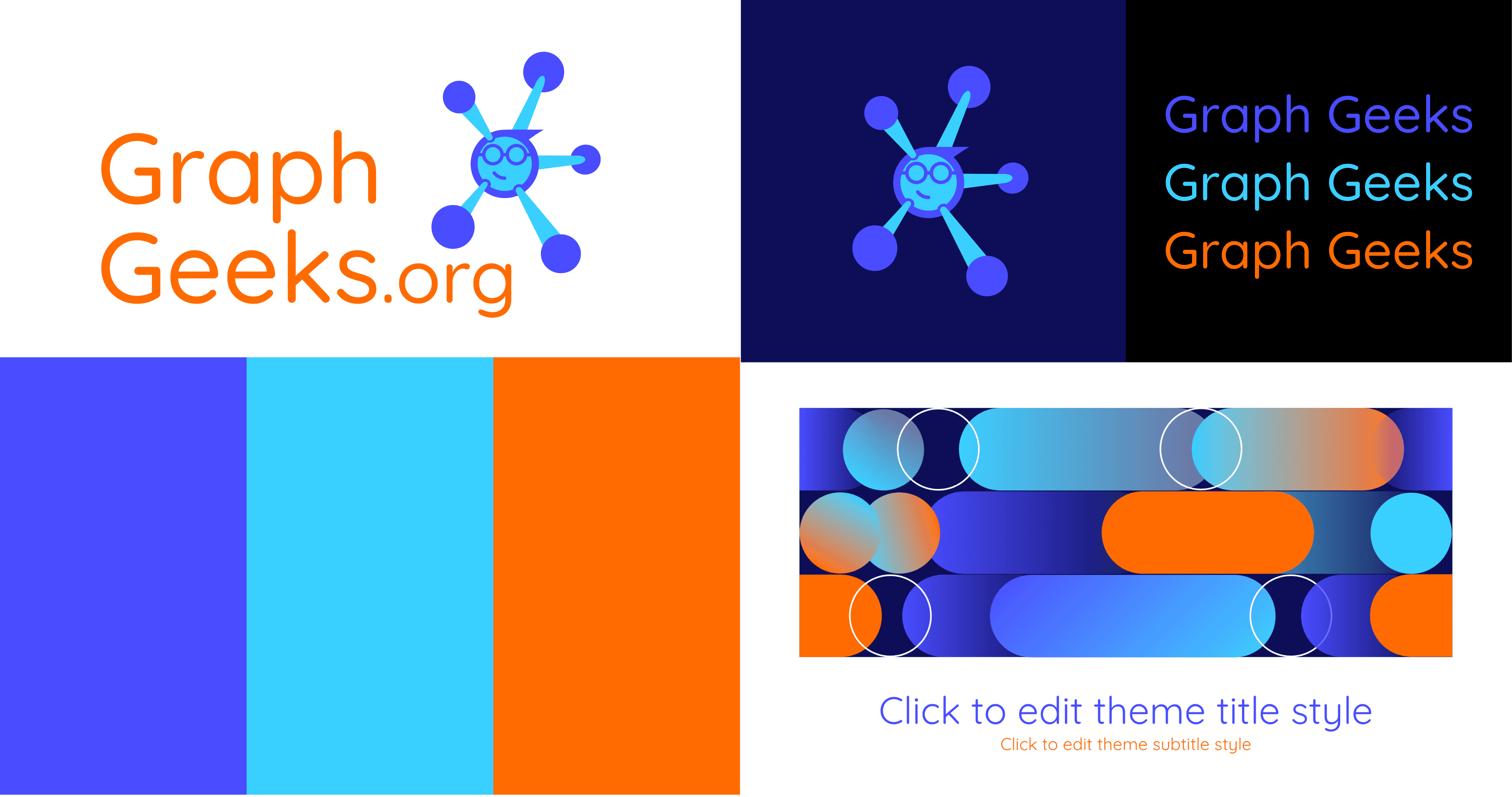
Fun + Experimental
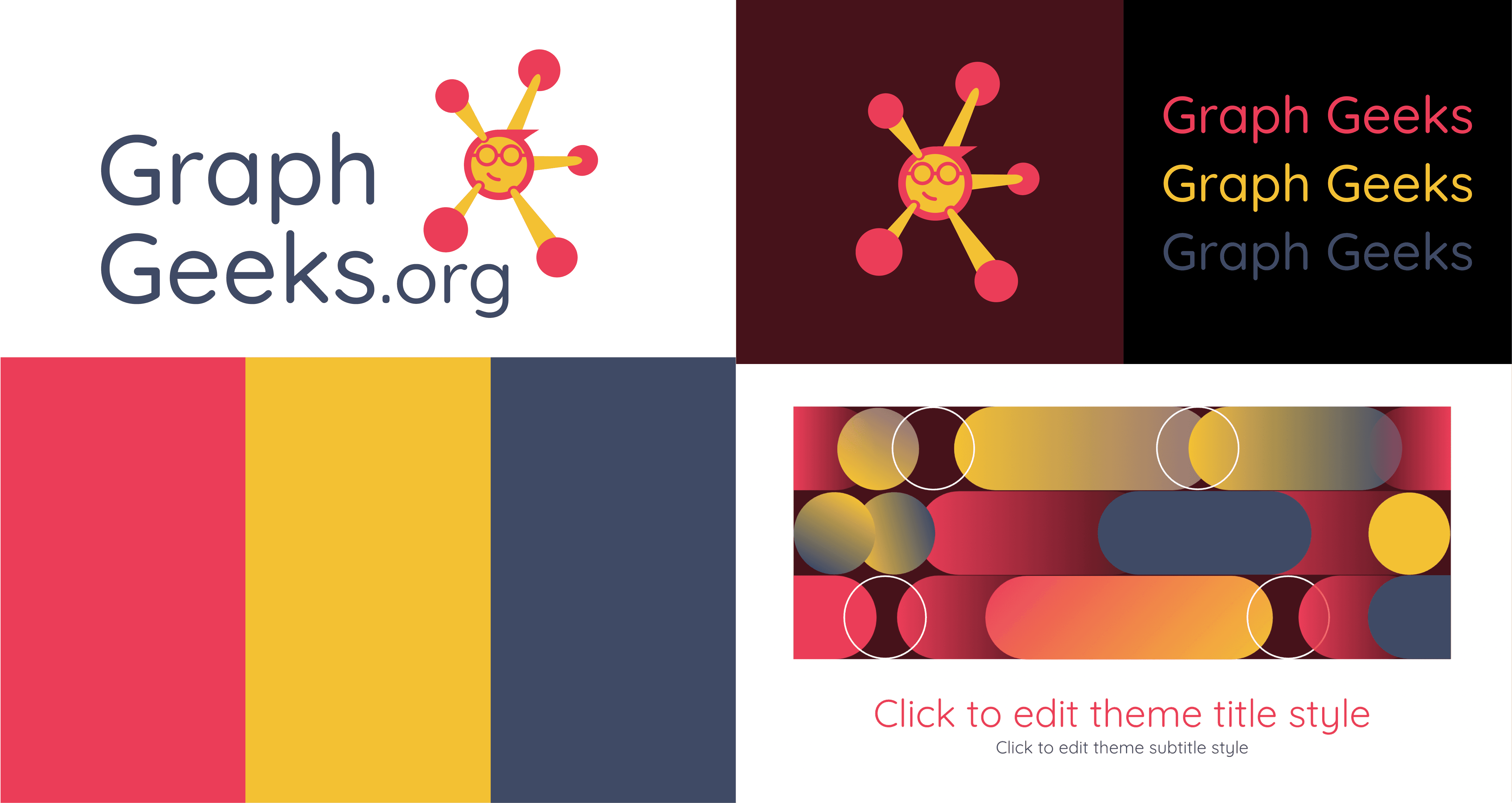
Fresh + Serious
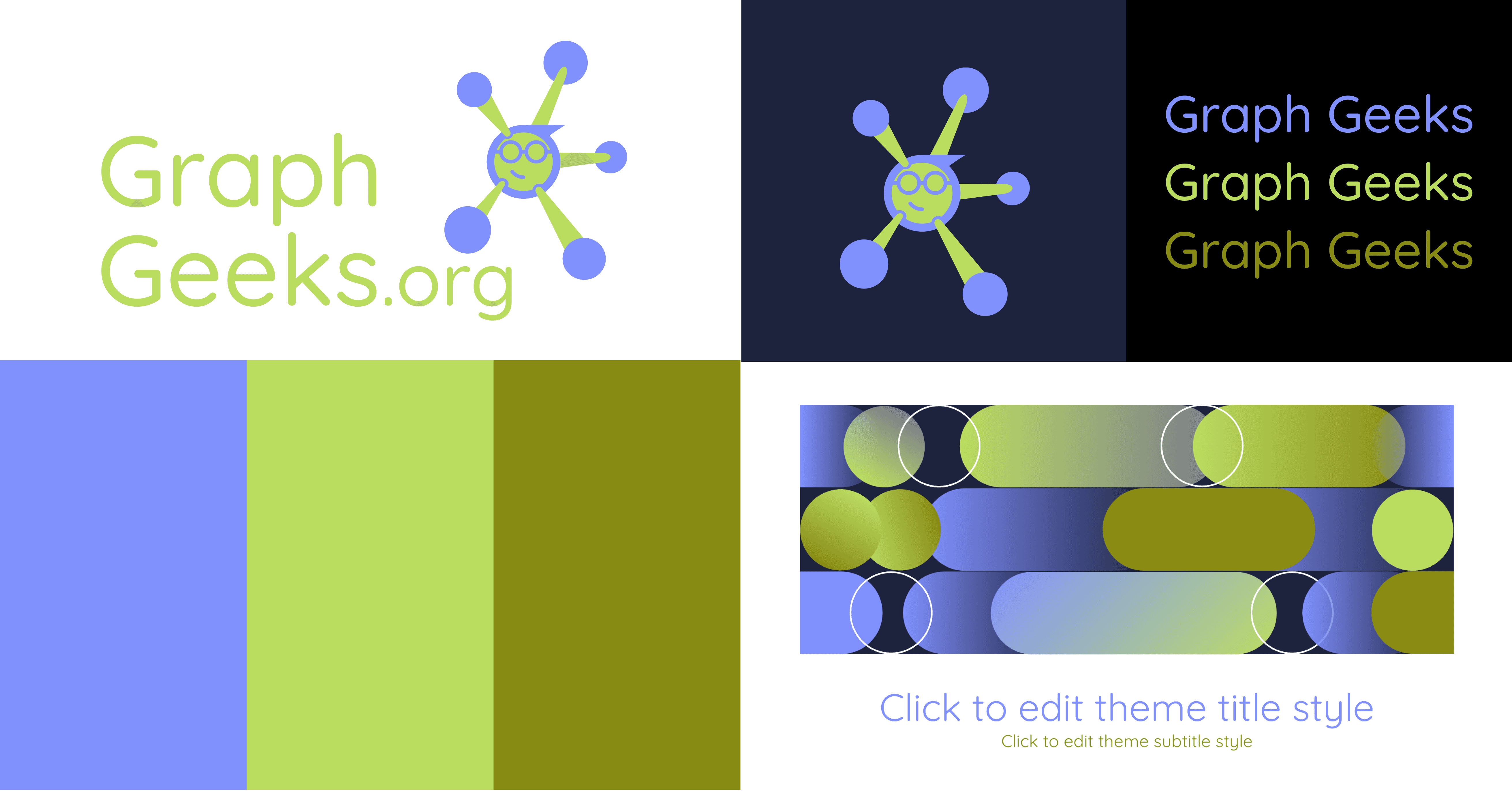
Tech + Community
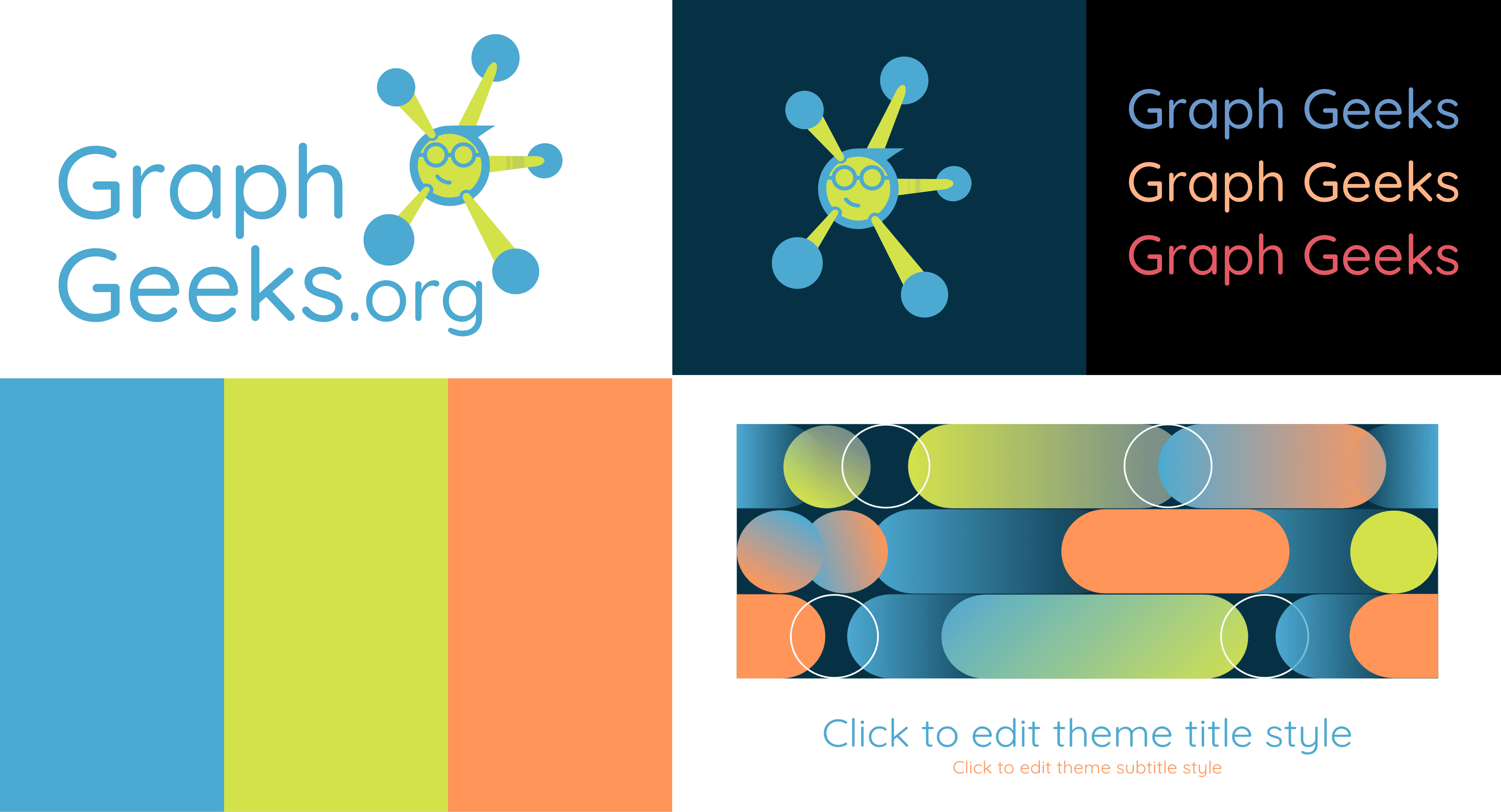
Mature + Standout
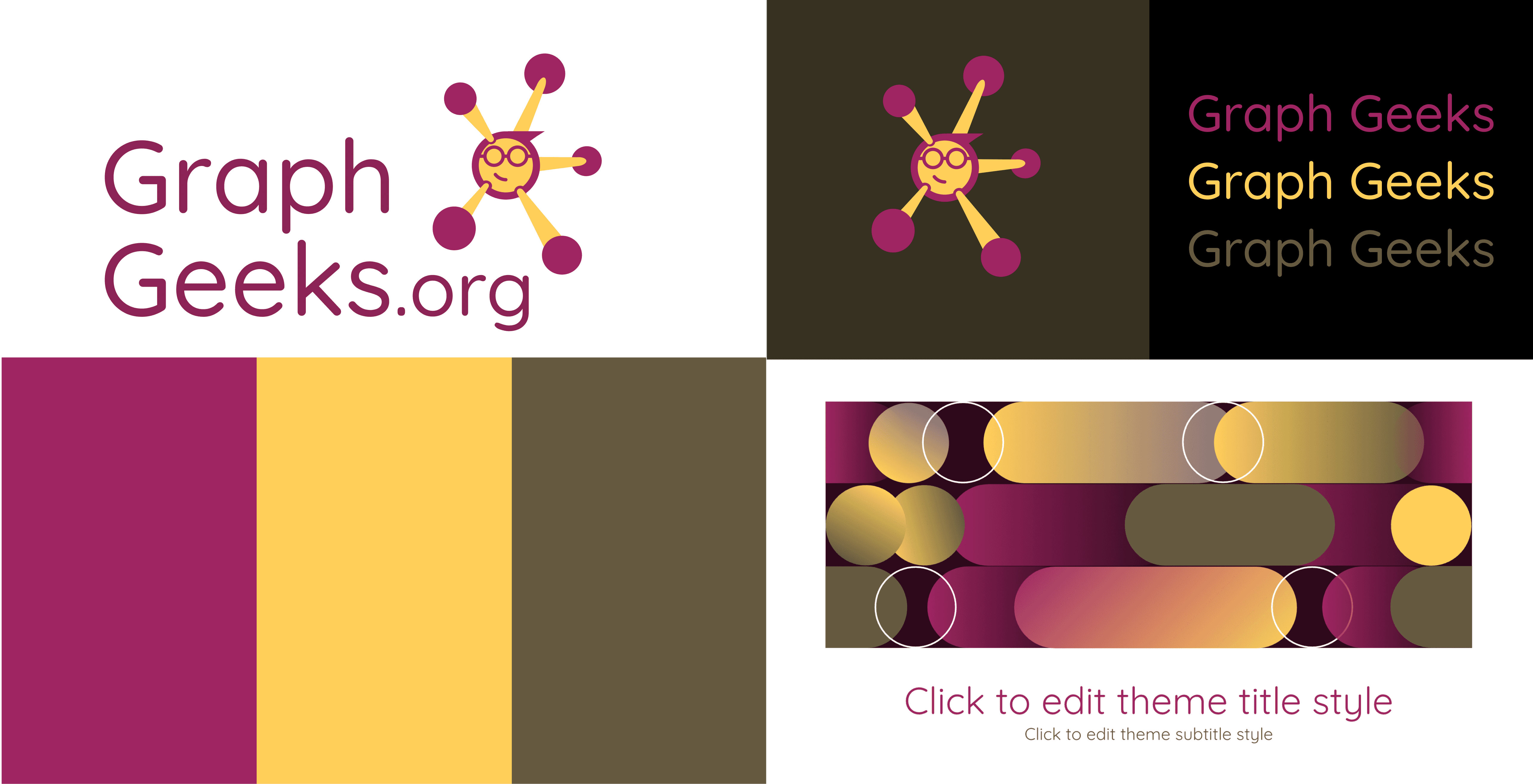
Step 2: Detailed Designs and Templates
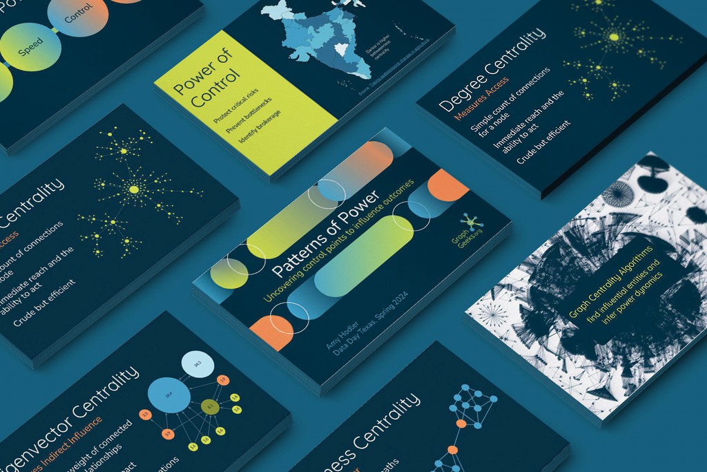
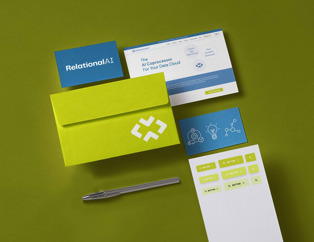
With the color palette approved, we got to work. We created a variety of logo concepts, each embodying the community's vision and mission. Once the final logo was selected, we expanded the identity into detailed templates, including business cards, letterheads, social media graphics, and website elements. Every design was crafted to ensure consistency and visual appeal across all platforms.
Step 3: Identity Guidelines
To ensure the brand identity was used correctly and consistently, we developed comprehensive guidelines. These guidelines covered everything from logo placement and color usage to typography and imagery styles. We provided clear examples and do's and don'ts, making it easy for the client’s team to maintain the brand's integrity in all their communications.
The result
The community's fresh, cohesive look helped them stand out in the market, attracting many participants. The identity guidelines ensured that their brand remained consistent, professional, and impactful across all channels. By combining thoughtful color choices, detailed designs, and clear guidelines, we helped our client build a brand identity that truly resonated with their audience and supported their growth.
The Challenge
Our client was building a community of knowledge graph and data analytics enthusiasts and needed a cohesive brand identity that would set them apart in a competitive market. They wanted a vibrant, modern look that reflected their innovative spirit.
Step 1: Color Options
We presented a spectrum of color palettes, each chosen to evoke different emotions and align with the brand's values. After thoughtful discussions and feedback sessions, we zeroed in on a dynamic palette of blues and greens, symbolizing trust and growth.
Homely + Laid back

New age + Attention-grabbing

Fun + Experimental

Fresh + Serious

Tech + Community

Mature + Standout

Step 2: Detailed Designs and Templates
With the color palette approved, we got to work. We created a variety of logo concepts, each embodying the community's vision and mission. Once the final logo was selected, we expanded the identity into detailed templates, including business cards, letterheads, social media graphics, and website elements. Every design was crafted to ensure consistency and visual appeal across all platforms.

Step 3: Identity Guidelines
To ensure the brand identity was used correctly and consistently, we developed comprehensive guidelines. These guidelines covered everything from logo placement and color usage to typography and imagery styles. We provided clear examples and do's and don'ts, making it easy for the client’s team to maintain the brand's integrity in all their communications.
The result
The community's fresh, cohesive look helped them stand out in the market, attracting many participants. The identity guidelines ensured that their brand remained consistent, professional, and impactful across all channels. By combining thoughtful color choices, detailed designs, and clear guidelines, we helped our client build a brand identity that truly resonated with their audience and supported their growth.
The Challenge
Our client was building a community of knowledge graph and data analytics enthusiasts and needed a cohesive brand identity that would set them apart in a competitive market. They wanted a vibrant, modern look that reflected their innovative spirit.
Step 1: Color Options
We presented a spectrum of color palettes, each chosen to evoke different emotions and align with the brand's values. After thoughtful discussions and feedback sessions, we zeroed in on a dynamic palette of blues and greens, symbolizing trust and growth.
Homely + Laid back

New age + Attention-grabbing

Fun + Experimental

Fresh + Serious

Tech + Community

Mature + Standout

Step 2: Detailed Designs and Templates
With the color palette approved, we got to work. We created a variety of logo concepts, each embodying the community's vision and mission. Once the final logo was selected, we expanded the identity into detailed templates, including business cards, letterheads, social media graphics, and website elements. Every design was crafted to ensure consistency and visual appeal across all platforms.

Step 3: Identity Guidelines
To ensure the brand identity was used correctly and consistently, we developed comprehensive guidelines. These guidelines covered everything from logo placement and color usage to typography and imagery styles. We provided clear examples and do's and don'ts, making it easy for the client’s team to maintain the brand's integrity in all their communications.
The result
The community's fresh, cohesive look helped them stand out in the market, attracting many participants. The identity guidelines ensured that their brand remained consistent, professional, and impactful across all channels. By combining thoughtful color choices, detailed designs, and clear guidelines, we helped our client build a brand identity that truly resonated with their audience and supported their growth.
